Bootstrap Grid Controls
Bootstrap
Row Control Properties
Bootstrap
Column Control Properties
Bootstrap
Breakpoint Column Widths tab
See also: Bootstrap Grid Documentation, Using Bootstrap with Verj.io
Description
Bootstrap’s grid system uses a series of rows and columns to layout and align content. It provides the basis for a responsive layout where the columns can be configured to break at different device viewport widths.
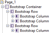
Two controls are provided Bootstrap Row Control and Bootstrap Column Control and these are combined to create a Bootstrap grid. A Bootstrap Column Control can only be added as an immediate child of a Bootstrap Row Control. A typical configuration might be:

A parent control of either Bootstrap Container Control (as shown above) or a Page Control with the Root container type property configured is required to use Bootstrap grids.
These controls are only available when a form is configured to use bootstrap i.e. the framework property in Form Properties is configured to use bootstrap (by default this property is inherited from the Presentation Template).
See also Bootstrap Grid Documentation for a more detailed description of bootstrap grid capabilities and classes.
Bootstrap Row Control Properties
See also control common properties and local/inherited control properties.
Bootstrap tab
|
Property |
Description |
Name1 |
Type1 |
Get1 |
Set1 |
Get/Set Values1 |
|
Row Type |
This is only available in bootstrap version 4 Options: Row – results in the use of the bootstrap standard row class Form Row - results in the use of the bootstrap form-row class, a variation that overrides the default column gutters for tighter and more compact layouts. Use this when the row content contains enterable form fields. |
rowType |
Character |
Yes |
Yes |
Row Form Row |
|
Vertical Alignment |
Options: Start – results in the use of the bootstrap align-items-start class. Aligns content to the top. Center - results in the use of the bootstrap align-items-center class. Aligns content to the center. End - results in the use of the bootstrap align-items-end class. Aligns content to the bottom. Baseline – results in the use of the bootstrap align-items-baseline class. Aligns content to the baseline. Stretch - results in the use of the
bootstrap align-items-stretch class.
Stretches the content to fill the container. |
verticalAlignment |
Character |
Yes |
Yes |
Start Center End |
|
Horizontal Alignment |
Options: Start – results in the use of the bootstrap justify-content-start class. Aligns content to the left. Center - results in the use of the bootstrap justify-content-center class. Aligns content to the center. End - results in the use of the bootstrap justify-content -end class. Aligns content to the right. Around - results in the use of the bootstrap justify-content -around class. Aligns columns in the row so that there is an equal gap between each of the columns and the start and end of the row. Between - results in the use of the bootstrap justify-content -between class. Aligns columns in the row so that any gap is between the columns and not at the start or end of each row. |
horizontalAlignment |
Character |
Yes |
Yes |
Start Center End Around Between |
|
Gutters |
Normally columns have horizontal padding to create the gutters between individual columns. However, you can remove the margin from rows and padding from columns by unchecking this option. In
bootstrap v4, the no-gutters class will
be added to the row. |
gutter |
Boolean |
Yes |
Yes |
true/false |
|
Gutter size |
This is only available in bootstrap version 5 Sets the size of horizontal and vertical gutters between columns. Integer values map to the bootstrap g-* classes. e.g. When the value is 1, bootstrap class g-1 will be added to the row |
gutterSize |
Integer |
Yes |
Yes |
an integer normally 1-5 no value null |
See Panel Control for all other properties.
Bootstrap Column Control Properties
See also control common properties and local/inherited control properties.
Bootstrap 4 Grid Documentation, Bootstrap 5 Grid Documentation
Bootstrap tab
|
Property |
Description |
Name1 |
Type1 |
Get1 |
Set1 |
Get/Set Values1 |
|
Vertical Alignment |
Sets the vertical alignment for this specific column, overriding the same property set on the parent row. Options: Start – results in the use of the bootstrap align-self-start class. Aligns the column to the top. Center - results in the use of the bootstrap align-self-center class. Aligns the column to the center. End - results in the use of the bootstrap align-self-end class. Aligns the column to the bottom. Baseline – results in the use of the bootstrap align-self-baseline class. Aligns the column to the baseline. Stretch - results in the use of the bootstrap align-self-stretch class. Stretches the column to fill the container. |
verticalAlignment |
Character |
Yes |
Yes |
Start Center End |
Bootstrap Breakpoint Column Widths tab
Bootstrap 4 Grid Documentation, Bootstrap 5 Grid Documentation
|
Property |
Description |
Name1 |
Type1 |
Get1 |
Set1 |
Get/Set Values1 |
|
Extra small |
See below |
extraSmallWidth |
Character |
Yes |
Yes |
See below |
|
Small |
|
smallWidth |
Character |
Yes |
Yes |
|
|
Medium |
|
mediumWidth |
Character |
Yes |
Yes |
|
|
Large |
|
largeWidth |
Character |
Yes |
Yes |
|
|
Extra Large |
|
extraLargeWidth |
Character |
Yes |
Yes |
|
|
Extra Extra Large |
Introduced in Bootstrap 5 |
extraExtraLargeWidth |
Character |
Yes |
Yes |
|
This is the mechanism that is used to provide a responsive layout which adapts to different device viewport sizes. The viewport size may vary by the user shrinking the browser manually or because it is constrained by the physical size of the screen (e.g. by a phone).
Bootstrap by default divides a 100% width into 12 “columns” and bootstrap widths are specified as a number of these columns i.e. 1 - 12. So for example a value of 12 represents 100% of the available width, 6 represents 50%, 3 represents 25% etc. An individual column shouldn't be assigned a width of more than 12, but it is possible for individual columns in a row to add up to more then 12; those columns will then wrap onto the next line.
Bootstrap defines 6 viewport size breakpoints: the first breakpoint (extra small) is the default breakpoint which is defined as any width over 0px. The next breakpoint (small) becomes active at 576px, and the next at 768px and so on (note, these pixel sizes are configurable).
- extra small: starts when the browser is at least 0px wide
- small: starts when the browser is at least 576px wide. This represents a small screen width e.g. a phone.
- medium: starts when the browser is at least 768px wide. This represents a slightly bigger screen width, e.g. a tablet.
- large: starts when the browser is at least 992px wide. This represents a desktop-sized screen/browser.
- extra large: starts when the browser is at least 1200px wide. This represents large desktop-sized screen/browser
- extra extra large: starts when the browser is at least 1400px wide. This represents larger desktop-sized screen/browser. Introduced in Bootstrap 5.
The options that can be set for each column width property are:
- Not Set – no width value is configured and the result is that the next smallest configuration will apply (use value 0 when setting via a script)
- Content Width – the column will be as wide as it needs to be to accommodate its content (use value -1 when setting via a script)
- Equal Width – the column will be assigned an equal width based on the remaining width (use value -2 when setting via a script)
- Values 1 : 12 – the “twelfth” column width values as described above
This gives you the ability to configure different column widths for different device sizes.
The default column width values are:

This will result in equal sized columns on a single line for all viewport sizes from the largest down to the smallest breakpoint 576px:

..and then multiple lines for extra small (phone) viewport sizes:

Let’s take a slightly more complicated example of four columns. With large devices I would like four columns of 25%, but on tablets I want that to adjust to two columns of 50% and then finally to adjust to a single column on phones. This is achieved by configuring each column like this:

And here are the results:
..on large and larger devices:
![]()
..on tablet-sized devices:

..and on phone-sized devices:

Bootstrap Breakpoint Row Columns tab
Bootstrap 5 Grid Documentation
The breakpoint row columns were introduced with Bootstrap 5.
|
Property |
Description |
Name1 |
Type1 |
Get1 |
Set1 |
Get/Set Values1 |
|
Extra small |
See below |
extraSmallColumns |
Character |
Yes |
Yes |
See below |
|
Small |
|
smallColumns |
Character |
Yes |
Yes |
|
|
Medium |
|
mediumColumns |
Character |
Yes |
Yes |
|
|
Large |
|
largeColumns |
Character |
Yes |
Yes |
|
|
Extra Large |
|
extraLargeColumns |
Character |
Yes |
Yes |
|
|
Extra Extra Large |
|
extraExtraLargeColumns |
Character |
Yes |
Yes |
|
Specify the breakpoint row columns to quickly set the number of columns that best render your content and layout. The property is used to specify the number of columns to render for each row. The number of columns can be specified for different viewport sizes. Click here for information relating to viewport sizes.
The options that can be set for each column width property are:
- Not Set – no number of columns is configured and the result is that the next smallest configuration will apply (use value 0 when setting via a script)
- Content Width – the columns will be laid out using their natural width (use value -1 when setting via a script)
- Values 1:6 – Specify the number of columns to laid out for each row.
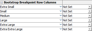
The default row columns values are:

No row columns are specified. The columns are laid out based on the natural width of the column:
![]()
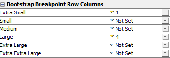
The following example:

This will result in 4 columns laid out on large devices (992px) and above:
![]()
…for devices extra small to medium devices:

See Panel Control for all other properties.