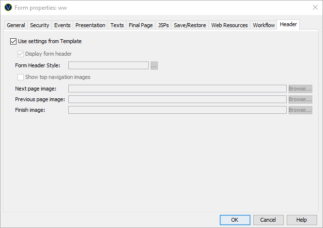
Form Properties – Header
Properties
See also: Forms, How Style is Applied, Application Layouts, Themes, Working with Presentation Templates
Header Properties
The following properties are available in the Header tab of the Form Properties dialog.
|
Property |
Description |
|
Check this option to indicate that all settings are taken from the Form defaults section of the presentation template. |
|
|
Display form header |
Check this option to include the optional form header text panel at the top of each page of the form |
|
Form Header Style |
The CSS class and style applied to the form header text. Note that this styling can also be configured for each individual page using the Page Control Styling Assistant (and default Page Control values can be configured in a presentation template). When there is a conflict in these styling properties, the value specified here (in Form Properties) will be used. |
|
Show top navigation images |
Check this option to include the appropriate page navigation image buttons to the right of the form header text. These buttons are shown when a form header text exists and an image URL has been configured. |
|
Next page image |
The image URL of the next page image button. This is displayed when a next page exists. See Page Sequencing. |
|
Previous page image |
The image URL of the previous page image button located to the right of the form header text. This is displayed when a previous page exists. See Page Sequencing. |
|
Finish image |
The image URL of the finish image button located to the right of the form header text. This is displayed when no next page exists. See Page Sequencing. |
Using an Application Layout
It is not possible to configure Header settings if the Form is configured to use an Application Layout. The Header settings will be set from the Application Layout settings. All checkboxes and text fields will be disabled and the settings will be automatically filled in from the Application Layout settings.
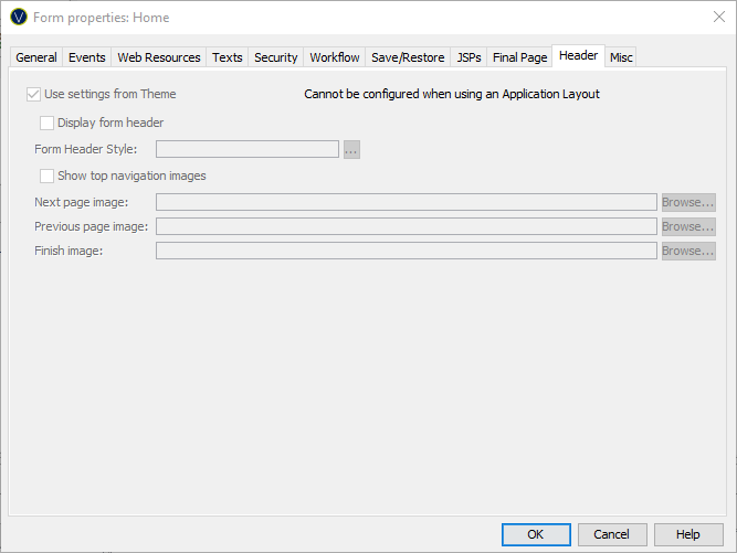
Using a Theme or Template
The Header tab contains options to configure the form header text panel. The form header text is a single text that can be displayed at the top of each page. The text is configured in texts tab or by double clicking on the form header text in the WYSIWYG panel.
The Form Header is not written out to the page when the Form is using a Theme.