Table Display Features
Table
Navigation Bar and Vertical Scrolling.
See also: Tables, Table Scripting,
Table Control, Repeater
Control
This document describes a number of built-in features available for Table Controls. A Repeater Control can also be used to display tables and this makes it possible to display each table row in a more flexible way e.g. across multiple lines. Of the display features described in this document, only vertical scrolling and nested tables are also supported by Repeater Controls.
User
row selection
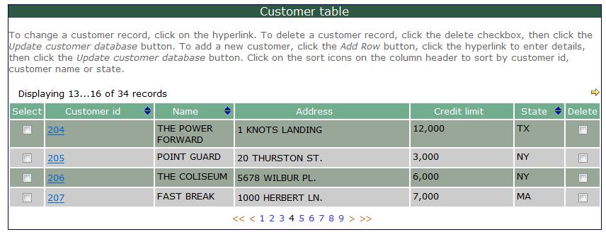
An additional Select checkbox column can be
inserted as the first visible row as shown in the example below. This is
requested by setting the Show select column Table
Control property. Appearance of the select column can be customized with
properties in the Select column tab
of Table Control. The Select
column header text is System text 376.

The user selection can then be processed in a script by
checking the $ROW_SELECTED system
variable or using the API
Table.isRowSelected() method. For example, the on click script for the
'Edit selected customer' button might look like this:
API:
var rows = tables.CUSTOMERS.rows;
while (rows.hasNext())
{
if (tables.CUSTOMERS.isRowSelected())
{
form.gotoPage(pages.CUSTOMER_DETAIL);
}
}
FPL:
loop at table CUSTOMERS
if [
$ROW_SELECTED = 'Y' ]
goto page
CUSTOMER_DETAIL;
endif
endloop
The current row in the CUSTOMERS table is set to the row
selected by the user, and any references to table columns from the
CUSTOMER_DETAIL page or subsequent pages are interpreted as referring to this
row.
User selections can be manually set and cleared using the
FPL setrow/unsetrow SELECTED commands or the API Table.setRowSelected() method, both of which which also
set the $ROW_SELECTED system variable.
User deletion of rows
A table can optionally be configured to allow deletion of rows by end users. This is requested by setting the Show delete column Table Control property. If this option is selected, a Delete checkbox column is added to the far right of the display as shown in the example below. The Delete column header text is System text 377.
Rows selected by the user for deletion are not removed from the table until an FPL updatetable command or API Table.updateTable() method is issued. When updatetable is processed, the rows are removed from the table, are removed from the display presented to the user, and are removed from the backing resource e.g. database resource, if one exists. Until this point, the user has the option to change her mind by unchecking the delete checkbox.
For each row marked for deletion by the user, system variable $ROW_DELETED is set to 'Y' and can be checked by a FPL script; alternatively the API Table.isRowDeletedByUser() method can be used.
The marked for deletion indicator can be set and cleared
using the FPL setrow/unsetrow DELETED commands or the API Table.setRowDeleted() method, both of
which which also set the $ROW_DELETED system variable.
When a row is marked for deletion, any data entered by the
end user is ignored and all validation for the row is disabled. Specifically,
client-side validation of mandatory input and checking for numeric and date
formats is disabled, and server-side field validation events are also disabled.
However, hyperlink and on click events for the row are still processed.

Rows can also be deleted programmatically using the FPL deleterow command or the API Table.deleteRow() method.
User row insertion
An add row button can be added at the bottom of the table display to allow insertion of rows by end users. This is requested by setting the Show add row button Table Control property. When the add row button is clicked, a new table row is inserted and the add row event is triggered. The add row event is typically used to assign values to columns in the new row.
The Add Row button
text is System text 374.
A new row is always inserted at the bottom of the table,
becomes the current row, and the focus is
changed to make the new row visible. Column values are set to null or a default
value if one exists. For each row inserted, system variable $ROW_INSERTED is
set to 'Y' and can be checked by an FPL script if necessary; alternatively the
API Table.isRowInserted() method can
be used.
A new row is initially treated as being empty. A row loses its empty status when at least one value is
entered in the row by the end user - setting values in other ways e.g. using
the add row event does not affect the empty status. Empty rows in a table
differ from other rows in the following respects:
- Client
side validation of mandatory fields is not done
- Validation
events are not run
- Empty
rows are ignored by updatetable
- However, on click
events (e.g. for buttons or hyperlinks) are honoured (i.e. are executed)
The empty status can be set and cleared using the FPL setrow/unsetrow
EMPTY commands or the API Table.setRowEmpty()
method, both of which which also set the $ROW_EMPTY system variable.
Rows can also be inserted programmatically using the FPL insertrow command or the API Table.insertRow() method.
Horizontal
Scrolling
Horizontal
scrolling is activated automatically when the table has more than one Table
Page control. When the system detects that horizontal scrolling is applicable,
scrolling icons ![]() and
and ![]() are inserted on the
right-hand side at the top of the table.
are inserted on the
right-hand side at the top of the table.

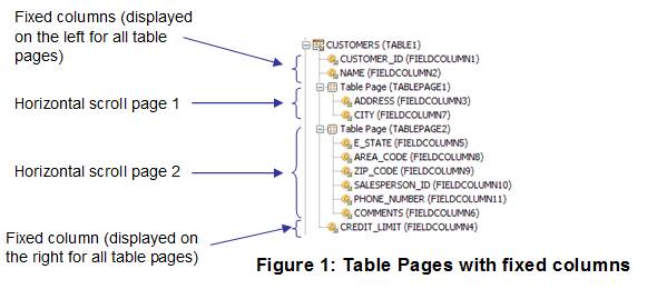
One or more columns can be fixed and
these columns are always displayed on every horizontal page regardless of which
horizontal page is displayed. A column becomes fixed when it is added directly to the Table Control (as opposed to
a Table Page Control). Fixed columns can appear to either the right or the left
of any columns in a Table Page Control depending on their position relative to
the Table Page Control as shown below.

A horizontal scroll request is treated as a table internal event: all enterable table data is first validated before the request is executed. If an error or warning message is issued by a validation event, the scroll request is not honoured.
Table Navigation Bar and Vertical Scrolling
When the number of rows in the table is greater than the number of rows to be displayed, the table navigation bar is displayed. This consists of:
- An optional prefix text such as Go to page:
- Up to four vertical scrolling icons or texts corresponding to scroll to top, scroll up, scroll down, scroll to bottom.
- A
number of clickable page numbers
A large
number of options are provided to configure the navigation bar – see Table Control properties or Repeater Control properties for details.

A vertical scroll request is treated as a table internal event: all enterable table data is first validated before the request is executed. If an error or warning message is issued by a validation event, the scroll request is not honoured.
Sorting
Each column can be declared as sortable by selecting the Sortable property for the table column
control. When a column is sortable, sort icons are added to the right of the
column header text as shown in the example below. Initially the unsorted icon ![]() is shown to indicate that the column is
sortable but has not yet been sorted. When the user clicks on this icon, the
table is sorted in ascending order. Thereafter, the system toggles between an
ascending and descending sort and the appropriate icon
is shown to indicate that the column is
sortable but has not yet been sorted. When the user clicks on this icon, the
table is sorted in ascending order. Thereafter, the system toggles between an
ascending and descending sort and the appropriate icon ![]() or
or ![]() is displayed to show the next available
sort direction.
is displayed to show the next available
sort direction.

A user sort request is treated as a table internal event: all enterable table data is first validated before the request is executed. If an error or warning message is issued by a validation event, the sort request is not honoured.
A table can also be sorted from a script using either the
FPL sort command or one of the API Table.sort() methods.
Nesting
Tables
Parent child relationships can be displayed by nesting one table inside another. This is supported for both Table Controls and Repeater Controls. Click here for further details.