Field and Table Column Properties
Field properties are displayed in the Properties View panel when a field is selected in the Fields View panel or a table column is selected in the Tables View.
See also: Field Types, Field Display Types, Designing For Accessibility
General tab
|
Property |
Description |
||||||||||||||
|
Field name |
The name of the field or table column. |
||||||||||||||
|
Defines the field type.
Select a value from the dropdown list. The default field type for new fields
is Character. |
|||||||||||||||
|
Default value |
The default value initially assigned to the field. The value must be consistent with the field type.
|
||||||||||||||
|
Validators |
In addition to the validation of field type and mandatory fields, system validators can be used to validate data entered by the user. |
||||||||||||||
|
Rounding |
Applies only to fields of field
type Numeric and Currency and specifies the rounding mode
applied each time a numeric value is stored and the value contains more
decimal places than the target field.
The default is Half up. |
||||||||||||||
|
Decimal digits |
The number of decimal digits (numeric fields only) |
||||||||||||||
|
Event field |
Indicates this field is an event
field. An event field is a special type of form field that has the following
characteristics: ·
It is never displayed to the user ·
before field and field validation events are always fired See Server-side Events for more information on event fields. |
||||||||||||||
|
Return field |
Indicates that the field will be returned to a calling form when this form is called using the CALL FORM command. Only applies to called forms. Note that this option is required in order to receive return parameters from a called form. |
||||||||||||||
|
Indicates that a value for the field can be included on the URL that invokes the form or can be passed from a calling form. The parameters button on the form toolbar gives a display of all fields with this option set. Note that this option is required in order to receive a parameter from the invoking URL. |
|||||||||||||||
|
Encrypted
parameter |
This option only has meaning when the URL parameter option is also selected. It indicates that an additional parameter will be passed containing an encrypted value of the parameter value. The encrypted value will be checked against the parameter value to ensure that the parameter has not been changed. (See Encryption of form parameters for more information) |
||||||||||||||
|
Client
accessibility |
This property controls whether the field can be accessed by the Client API. By default a field is not accessible. See Client Accessible Fields and Tables for more information. |
Presentation tab
|
Property |
Description |
||||||||||||||||||||||||||
|
Defines the display type. Mostly this corresponds to
the HTML input type used to display the field in edit mode. |
|||||||||||||||||||||||||||
|
Display length |
Defines the width of the input box as the number of characters specified – the actual size of the rendered input box will vary slightly between browsers. Initially this is set with a default value that varies according to the field type: 30 for character fields, 10 for integer fields etc. Note that this is not the same as maximum length which is specified as a validator. |
||||||||||||||||||||||||||
|
Number of rows |
This applies only to fields with display type Textarea and is the number of rows displayed (The width of each row is specified by display length). |
||||||||||||||||||||||||||
|
This option applies only to the display of lists using either radio buttons and checkboxes. The list options will be rendered using HTML <fieldset> and <legend> tags e.g. <fieldset> <legend>Choose
a shipping method:</legend> <input
id="overnight" type="radio" name="shipping"
value="overnight"> <label
for="overnight">Overnight</label><br> <input
id="twoday" type="radio"
name="shipping" value="twoday"> <label
for="twoday">Two day</label><br> <input
id="ground" type="radio" name="shipping"
value="ground"> <label
for="ground">Ground</label> </fieldset> This is a requirement to achieve WCAG compliance. See Designing For Accessibility. When used in a Field Grid Layout, the HTML above will be written left aligned i.e. aligned with the field label column. Note that when used with Bootstrap, default styling of the legend tag is supplied in the Bootstrap CSS and this applies a font-size of 1.5rem which makes the field label appear larger than usual. You may want to change this CSS. |
|||||||||||||||||||||||||||
|
Alignment |
Specifies the alignment used to display radio buttons or checkboxes. Horizontal or vertical can be selected. This option is only available if the field has a display type of radio button or checkbox. |
||||||||||||||||||||||||||
|
Label position |
Specifies the position of the text element of radio button or checkbox fields. Left or right can be selected. This option is only available if the field has a display type of radio button or checkbox and it’s not available when using Bootstrap. |
||||||||||||||||||||||||||
|
Show digit group
separator |
For numeric and currency fields, specified whether to show the digit group separator e.g. whether to show 1,000 or 1000. |
||||||||||||||||||||||||||
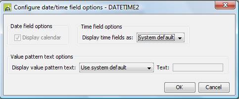
|
Date/time options |
Provides a number of options for fields with field type Date, Time or DateTime. Displays the following dialog:
|
||||||||||||||||||||||||||
|
Contains HTML |
Indicates that the field value contains formatting HTML. If the field value contains HTML and this option is not checked, the HTML will be escaped by the system and will appear as part of the data value displayed to the user. This option is only effective for display only fields. |
||||||||||||||||||||||||||
Mappings tab
This tab shows all the resources to which the field is mapped. If no mappings exist for the field, this section will be empty. Each property row in this section represents a single mapping and contains the resource name on the left and the resource field name on the right. The resource name is the resource name as displayed in the Resources View – this is not necessarily the name of the resource entity. If the mapping was made in a component, the component name is shown in brackets after the resource name.
Lists tab
|
Property |
Description |
||||||
|
Static List |
Associates the field with a Static List and displays entries from the list. Clicking the … button displays the Workspace Browser dialog and any Static List in the current project or any linked project can be selected. When a list is configured, hovering the mouse over the name will display the full path, double clicking on the name will open the Static List editor. A field can be associated with a Static List or a Dynamic List but not both. |
||||||
|
Dynamic
List |
Associates the field with a Dynamic List – a list obtained from a database - and displays entries from the list. Clicking the … button displays the Workspace Browser dialog and any Dynamic List in the current project or any linked project can be selected. When a list is configured, hovering the mouse over the name will display the full path, double clicking on the name will open the Dynamic List editor. A field can be associated with a Dynamic List or a Static List but not both. |
||||||
|
Dynamic
list mappings |
Displays a dialog where fields from the Dynamic List can be mapped to fields from the form. Click here for details. |
||||||
|
When
list is built |
Controls when the list is built. Click here for details. |
||||||
|
Set
field with single list value |
When this option is checked, a list that contains just a single entry will result in the field being set with the value prior to being displayed. This option is only available for fields with a display type of dropdown. Setting the immediate validation property on a linked Field Control or Table Column Control causes this option to be ignored. |
||||||
|
Header
text options |
Options that control the text displayed at the top of the list for dropdown fields. This text also represents a null value when selected by the user. Options are:
|
||||||
|
Custom
header text |
When Use custom text is specified for the previous property (Header text options), this text is displayed at the top of the dropdown list. This text also represents a null value when selected by the user. |
Texts tab
|
Property |
Description |
|
Label Text/Column Heading Text |
The field label text. For table columns, this is the column header text. |
|
Help text |
The field help text. This is not available for table columns. |